Monthly Archives: March 2012

Pull Pile Podcast – Design

At my good friend Rah Unique’s (@rah_unique) recommendation I began following the Pull Pile Podcast on Twitter and Facebook. Okay for the uninitiated a pull pile (or pull list) is a list of comic books that collectors subscribe to at their Comic Book Store. Most of you may remember being able to pick up comics at your local candy shop, super market, news stand  or 7/11. That distribution model is long gone, Comics are primarily found in specialty Direct Market and Hobby stores. So the podcast is about the new releases the two hosts pick up every Wednesday, the day new releases of comic books are sold. They also discuss films and television series and other related media.

So the hosts of the Pull Pile Podcast  The Head and Winthrop Chesterton wanted to create a new identity and presence online with a new logo and some original artwork. They reached out to their fan-base and followers on various social media platforms. I answered the call and they got in touch with me and told me what they needed. Here’s what they had a friend put together to give me a rough idea for what design challenges I had to meet.


The great thing about this is that these guys knew what they wanted and were able to clearly demonstrate what they needed from me. So I pretty much hopped on this as soon as I could, because although I hadn’t met them personally I felt like these were kindred spirits, I saw their tweets, listened to their podcast and there was even some interaction online. They use the hashtag #letstalkcomics to ask fans questions about comics, the characters, the creators and the industry in general. So as I said there was already a bond, a sense of fellowship. So I showed them some roughs that I worked on in Adobe Illustrator.


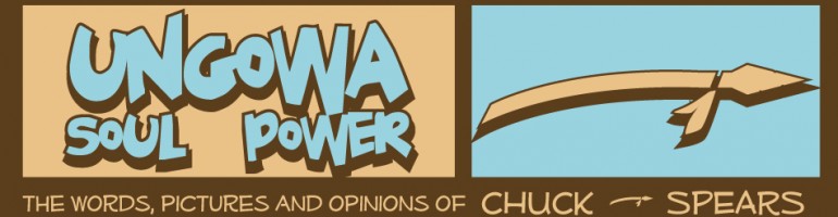
I started with the familiar old DC Comics logo as inspiration. Then I modified it to a series of Ps with the number three taking up residence in the curve of the letter P. Being comic fans they went with the DC bullet, and the masthead was a simple design with layered bold letters reminiscent of the silver-age of comic books, which is around the late 50s/early 60s, where the Justice League of America formed and The X-Men, Avengers, Spider-Man and other well known characters were first introduced or revamped.

I was told to move forward with these designs and gave them a swatch of these designs with different color schemes. Here are a few that they liked.


I used the banner on their podcast as inspiration for a few color schemes. They really seemed to appreciate that.

With that done it was on to the illustrations and the mock comic book cover. The characters were definitely interesting and fun to draw, one has no face, like The Question and the other, an over large cranium, like Megamind. I feel a bit longwinded at this point, so I’ll just show the final product. I know bandwith is a little crazy in some places and too many images can slow ya down, so here you go.

I put the comic on a bed of classics and maybe spent too much time rendering the headphones, but I like the work and more importantly so did Winthtrop and The Head.

And that my friends is that.

Hopefully I get more (paid) work in the future to showcase, it was fun and I wish these guys all the success in the world. If you’re a fan of comics follow them on twitter, listen to the podcast and tell ’em @Countbaqula sent you.

2 Comments

Filed under Art, Comics, Entertainment, graphics, logos, photoshop

A.B. Do Well – Logo

I’m still going through the missing files I have to replace. The logo I’m posting today is the one I used as a solo rapper. A.B. Do Well was the name I went by, and occasionally still use when in the company of those that remember and respect the name. Not a huge group of people, but definitely a sincere group. The name A.B. Do Well was a combination of things, it was a play on my actual name and a mission statement. A.B. is Abdul-Baqi, the name my mother gave me. It’s Arabic and Islamic, Al-Baqi is one of the 99 attributes of Allah, it means The Eternal/Enduring. Abdul is a title in arabic meaning (devout) servant or slave of God. So my first name translates to The Servant of the Eternal (God). Do Well is my intention and/or practice of making sure I put my best into all of my endeavors. Whatever I do the goal is to do it well. A.B. Do Well when pronounced all together sounds an awful lot like Abdul. That was the thought process behind the stage name way back when I was 19 or 20.

As for the logo I was keeping with the esoteric/mystical theme from the group Sight Beyond Light. For that I took the initials from the group name, SBL, and fashioned them into the All Seeing Eye, which is usually associated with the Eye of Horus and typically is a symbol for the sun. It also alludes to the Third Eye, which is a symbol for higher understanding and enlightenment.  For A.B. Do Well I borrowed the symbol of the Masons, a very widely known fraternal order that is for some reason considered a secret society. Their symbol is the compass and the square, tools for designing and architecture. The roots of the Masons is in building, generally with stones. But the compass and the square to me represent taking the long view and exercising proper and precise planning to achieve wondrous and dynamic goals that leave an indelible mark on society.  That’s a great symbol and philosophy to adopt. A but lofty, but if you don’t dream big, you don’t achieve big. Anyway, here’s a pic of the recreated A.B. Do Well logo.

Nice and simple, but I didn’t use the square because I was saying I had a more rounded view. YOu know how it is, you think you know everything at 20. More than people that have been around long enough to know better. More than ancient orders that have had centuries to think and plan. But like I said, lofty.

I was thinking this is a little to basic and played around with a nice new image based on a more modern logo for the Masons.

I kind of wish I played around more with the logo when I first created it. I’m really liking the update. I guess I have an excuse to start rapping again. This logo shows some growth and refinement. Pretty slick.

Well I’m sure I’ll have another lost logo up soon. Until then, Peace, be well and Do Well.

Leave a comment

Filed under Art, graphics, history, life, logos, music

P & Q Video and Back Story

I made a bunch of iMovie videos for some of my old songs to put on Youtube a few months back. They’re on my video page here, if you haven’t seen ’em check ’em out, they’re fun low budget takes on the songs I barely had money to record.

But anyways, I fully intended to make one for P & Q back then too. The chorus talked about  the if P then Q theory of logic learned in basic algebra, or Sequential One,and I wanted to use the text book Sub-Conscious and I used when we were in high school. A book pretty much every high school student in New York City used since the late 80s. Integrated Mathematics, Course I. I couldn’t find an image for the book online for the life of me, but mysteriously I found it yesterday. I only looked for it because my friend Rah Unique (@rah_unique) tweeted that he was now playing the song using the hash tag #NP, and he shouted me out @countbaqula. So, I found it and it’s very low resolution, but it was enough to make a mock book cover for the song.

 I took this and made this:

I may have gone a little to crazy trying to distress and age the book, but I was a man possessed. I was so happy to finally get a basic image that I played around with it for hours. After making the cover it was time to go ahead and make the video. And there it is below, for you viewing pleasure.

Leave a comment

Filed under Art, graphics, life, logos, music, photoshop

Low Tech Records

Not much to say here, this was the logo I came up with for Low Tech Records,the indie record label my rap group, Sight Beyond Light. We used it to press up our first single, New Beginning b/w Illusions; that I  spoke about in the last post, and a few other projects. Sub-Conscious released his first full length album, Lyric Lovers Deluxe, on Low Tech Records. I made a little promo album for Sight Beyond Light titled Vanishing Point of View and later pressed up A.B. Conversations, my solo project as A.B. Do Well that was sold hand-to-hand for the most part. I put a few up on CD-Baby, but like only a few I also had some up at a few digital retailers, they’re now closed though. But I still have a Myspace page up as A.B. Do Well. I don’t look at that page much, but you can.

So I think I’ll tackle the A.B. Do Well logo next time around. See you then, if not sooner. I’ve been working on on pages for The Stunning Beeboy and set up a different site for a web-comic. I know you all are on pins and needles, anxiously awaiting his debut, don’t worry he’ll bee here soon.(see what I did there?)

Leave a comment

Filed under Art, Entertainment, graphics, logos, music