Category Archives: graphics

Project CBRunway 7: Round 1- The Purple Haze

I may have mentioned that I am a member of the forums on Comic Book Resources. There’s an annual  Super Hero design/redesign competition on the Artist and Writer Showcase section of the forums called Project CBRunway and this is the 7th “season.”  I’ve participated in the competition a few times and it’s something I look forward to every year. This year hopeful participants had to submit basic costume designs for a hero and villain based on ourselves using a basic template model sheet. I went with the basic themes of positivity and negativity because these are drives and attitudes we all share, but when the mood shifts too far in one direction, you aren’t behaving like your normal self. First I got to work on the positive aspects using the mathematical symbol for plus(+) as an insignia and using bright colors, baby blue, white and yellow to show a positive attitude. And I used the minus(-) sign for the villain and inverted the colors on the computer to come up with that color scheme.  Anyway, here’s my submission.

Mas y Minus

Private Positive and Negatory. Great, right?

MattBib, the moderator of this section of the forums acts as Tim Gunn and gives us wild ideas for our weekly challenges. For the first challenge he came up with the name “Sounds of the Silver-Age” wherein the contestants had to pick an iconic Recording Artist from the 1960s and give that person a super hero costume from the silver-age era of comic books. Comic Book scholars and collectors understand the silver-age to be the period between the late 1950s to the early 1970s. In this period comic fans were introduced to the updated versions of the Flash and the Green Lantern over at DC Comics and Spider-Man, Iron Man, the Fantastic Four… well let’s say just about all the really popular characters over at Marvel Comics.

TM & (C) DC Comics

The Flash went from Jay Garrick to Barry Allen, Green Lantern from Alan Scott to Hal Jordan.

TM & (C) Marvel Comics

This Explosion of Characters came from what Stan Lee likes to call the Marvel Age of comics.

That’s what comics looked like in the Silver-Age, and as for the Music Icon from the 60s, I chose Jimi Hendrix. His look lends itself to the fantastic automatically. His dress was that of a gypsy pirate, with an attitude to match. Hopefully I don’t have to give him too much of an introduction, I’m guessing enough of you are experienced.

To distill Jimi to his most memorable visual components there were a few details I wanted to keep in mind, the Afro, The Bandana, The Goatee and the Vest. There are pictures out there where he doesn’t don the vest or bandana/headband, but in my head that’s what he always wore. A lot of fans say that he was known to keep a tab of LSD in his bandana for storage, but he would occasionally wind up tripping as his sweat dissolved the tab(s) leading the substance to seep into his system through his pores. As with many of the other contestants, I went to the his catalogue of songs for inspiration for his costumed identity. He’s got so many songs that would be great super hero names, Little Wing, Dolly Dagger, Stone Free, Night Bird Flying and Voodoo Child. For a while I was set on Voodoo Child. The lyrics to the first verse sound epic:

“…Well I’ll stand up next to a mountain, and I chop it down with the edge of my hand- Well I’ll pick up all the pieces and make an island, I might even raise a little sand- ‘Cause I’m a Voodoo Child, Lord knows I’m a Voodoo Child…”

With that bravado and cockiness as fuel I began sketching out his look. I tried bell bottom pants for him and frilly cuffs for his shirt sleeves but that was still saying Rock Star and not Super Hero. The one thing from his signature look that I could borrow from to make him a super hero was his bandana. I just rolled the headband down over his eyes and added some goggle lenses and boom, Super Hero. But nothing really came to me though that said Voodoo child and the Internet wasn’t working so well, so researching the symbolism of Voodoo wasn’t going to work out. Also I couldn’t get  the Marvel character Brother Voodoo out of my head. Below are some rough ideas/sketches.

Hmmm, none of these really say "VOODOO CHILD."

Voodoo Child wasn’t working out for me as a character and I didn’t have much time to work because the deadline for this challenge was creeping up on me. For some reason I considered Purple Haze. Time was working against me, so I threw together a quick simple cartoony sketch on some Borden and Riley vellum paper without a solid character model and design to work from. As simple as it was I really liked it. I was watching Adventure Time so that world of mirth and excitement may have slipped in and made me feel good about everything. It’s kind of like what I’d imagine an LSD trip to feel like. So from the sketch it was scanning time, soon to be followed by some coloring in PhotoShop. Here are the results.

 Exhibit C. In my defense I wanted an excuse to give him red eyes.

When working on a character with a purple color scheme, avoid using red.GARISH!!!

I could have gone down the coloring road all night, but it was late and I had to  get this in on time for the voting thread to go up.  To me A was too much like the Wonder Twins. B was a step in the right direction and C was a step in the wrong direction, ugh.  D although it’s basically a simple color swap of A really made things pop for me. It’s what I went with for the challenge. Check out the Project CBRunway: Challenge 1 voting thread and check out the other entries as well. If you’re inclined to vote I won’t stop you. The voting poll allows you to vote for multiple designs so no pressure.

And just for my Ungowa Soul Power visitors here’s a slightly modified image of  Jimi Hendrix, The Purple Haze.

The Purple Haze

Acting Funny, But I Don't Know Why?!? Excuse Me As I Kiss The Sky.

3 Comments

Filed under Art, Comics, Entertainment, graphics, history, music, pop culture

Pull Pile Podcast – Design

At my good friend Rah Unique’s (@rah_unique) recommendation I began following the Pull Pile Podcast on Twitter and Facebook. Okay for the uninitiated a pull pile (or pull list) is a list of comic books that collectors subscribe to at their Comic Book Store. Most of you may remember being able to pick up comics at your local candy shop, super market, news stand  or 7/11. That distribution model is long gone, Comics are primarily found in specialty Direct Market and Hobby stores. So the podcast is about the new releases the two hosts pick up every Wednesday, the day new releases of comic books are sold. They also discuss films and television series and other related media.

So the hosts of the Pull Pile Podcast  The Head and Winthrop Chesterton wanted to create a new identity and presence online with a new logo and some original artwork. They reached out to their fan-base and followers on various social media platforms. I answered the call and they got in touch with me and told me what they needed. Here’s what they had a friend put together to give me a rough idea for what design challenges I had to meet.


The great thing about this is that these guys knew what they wanted and were able to clearly demonstrate what they needed from me. So I pretty much hopped on this as soon as I could, because although I hadn’t met them personally I felt like these were kindred spirits, I saw their tweets, listened to their podcast and there was even some interaction online. They use the hashtag #letstalkcomics to ask fans questions about comics, the characters, the creators and the industry in general. So as I said there was already a bond, a sense of fellowship. So I showed them some roughs that I worked on in Adobe Illustrator.


I started with the familiar old DC Comics logo as inspiration. Then I modified it to a series of Ps with the number three taking up residence in the curve of the letter P. Being comic fans they went with the DC bullet, and the masthead was a simple design with layered bold letters reminiscent of the silver-age of comic books, which is around the late 50s/early 60s, where the Justice League of America formed and The X-Men, Avengers, Spider-Man and other well known characters were first introduced or revamped.

I was told to move forward with these designs and gave them a swatch of these designs with different color schemes. Here are a few that they liked.


I used the banner on their podcast as inspiration for a few color schemes. They really seemed to appreciate that.

With that done it was on to the illustrations and the mock comic book cover. The characters were definitely interesting and fun to draw, one has no face, like The Question and the other, an over large cranium, like Megamind. I feel a bit longwinded at this point, so I’ll just show the final product. I know bandwith is a little crazy in some places and too many images can slow ya down, so here you go.

I put the comic on a bed of classics and maybe spent too much time rendering the headphones, but I like the work and more importantly so did Winthtrop and The Head.

And that my friends is that.

Hopefully I get more (paid) work in the future to showcase, it was fun and I wish these guys all the success in the world. If you’re a fan of comics follow them on twitter, listen to the podcast and tell ’em @Countbaqula sent you.

2 Comments

Filed under Art, Comics, Entertainment, graphics, logos, photoshop

A.B. Do Well – Logo

I’m still going through the missing files I have to replace. The logo I’m posting today is the one I used as a solo rapper. A.B. Do Well was the name I went by, and occasionally still use when in the company of those that remember and respect the name. Not a huge group of people, but definitely a sincere group. The name A.B. Do Well was a combination of things, it was a play on my actual name and a mission statement. A.B. is Abdul-Baqi, the name my mother gave me. It’s Arabic and Islamic, Al-Baqi is one of the 99 attributes of Allah, it means The Eternal/Enduring. Abdul is a title in arabic meaning (devout) servant or slave of God. So my first name translates to The Servant of the Eternal (God). Do Well is my intention and/or practice of making sure I put my best into all of my endeavors. Whatever I do the goal is to do it well. A.B. Do Well when pronounced all together sounds an awful lot like Abdul. That was the thought process behind the stage name way back when I was 19 or 20.

As for the logo I was keeping with the esoteric/mystical theme from the group Sight Beyond Light. For that I took the initials from the group name, SBL, and fashioned them into the All Seeing Eye, which is usually associated with the Eye of Horus and typically is a symbol for the sun. It also alludes to the Third Eye, which is a symbol for higher understanding and enlightenment.  For A.B. Do Well I borrowed the symbol of the Masons, a very widely known fraternal order that is for some reason considered a secret society. Their symbol is the compass and the square, tools for designing and architecture. The roots of the Masons is in building, generally with stones. But the compass and the square to me represent taking the long view and exercising proper and precise planning to achieve wondrous and dynamic goals that leave an indelible mark on society.  That’s a great symbol and philosophy to adopt. A but lofty, but if you don’t dream big, you don’t achieve big. Anyway, here’s a pic of the recreated A.B. Do Well logo.

Nice and simple, but I didn’t use the square because I was saying I had a more rounded view. YOu know how it is, you think you know everything at 20. More than people that have been around long enough to know better. More than ancient orders that have had centuries to think and plan. But like I said, lofty.

I was thinking this is a little to basic and played around with a nice new image based on a more modern logo for the Masons.

I kind of wish I played around more with the logo when I first created it. I’m really liking the update. I guess I have an excuse to start rapping again. This logo shows some growth and refinement. Pretty slick.

Well I’m sure I’ll have another lost logo up soon. Until then, Peace, be well and Do Well.

Leave a comment

Filed under Art, graphics, history, life, logos, music

P & Q Video and Back Story

I made a bunch of iMovie videos for some of my old songs to put on Youtube a few months back. They’re on my video page here, if you haven’t seen ’em check ’em out, they’re fun low budget takes on the songs I barely had money to record.

But anyways, I fully intended to make one for P & Q back then too. The chorus talked about  the if P then Q theory of logic learned in basic algebra, or Sequential One,and I wanted to use the text book Sub-Conscious and I used when we were in high school. A book pretty much every high school student in New York City used since the late 80s. Integrated Mathematics, Course I. I couldn’t find an image for the book online for the life of me, but mysteriously I found it yesterday. I only looked for it because my friend Rah Unique (@rah_unique) tweeted that he was now playing the song using the hash tag #NP, and he shouted me out @countbaqula. So, I found it and it’s very low resolution, but it was enough to make a mock book cover for the song.

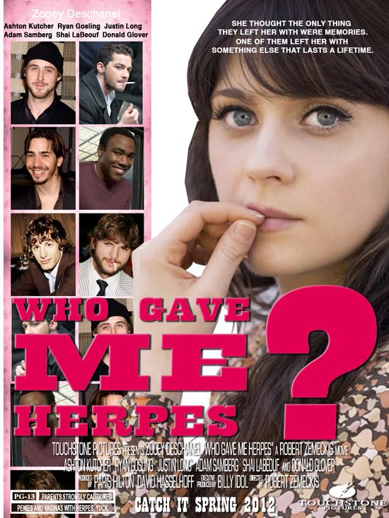
 I took this and made this:
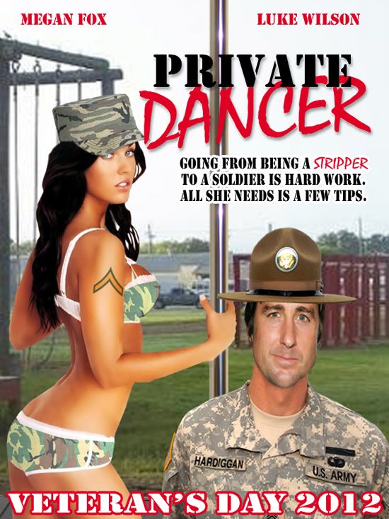
I may have gone a little to crazy trying to distress and age the book, but I was a man possessed. I was so happy to finally get a basic image that I played around with it for hours. After making the cover it was time to go ahead and make the video. And there it is below, for you viewing pleasure.

Leave a comment

Filed under Art, graphics, life, logos, music, photoshop

Low Tech Records

Not much to say here, this was the logo I came up with for Low Tech Records,the indie record label my rap group, Sight Beyond Light. We used it to press up our first single, New Beginning b/w Illusions; that I  spoke about in the last post, and a few other projects. Sub-Conscious released his first full length album, Lyric Lovers Deluxe, on Low Tech Records. I made a little promo album for Sight Beyond Light titled Vanishing Point of View and later pressed up A.B. Conversations, my solo project as A.B. Do Well that was sold hand-to-hand for the most part. I put a few up on CD-Baby, but like only a few I also had some up at a few digital retailers, they’re now closed though. But I still have a Myspace page up as A.B. Do Well. I don’t look at that page much, but you can.

So I think I’ll tackle the A.B. Do Well logo next time around. See you then, if not sooner. I’ve been working on on pages for The Stunning Beeboy and set up a different site for a web-comic. I know you all are on pins and needles, anxiously awaiting his debut, don’t worry he’ll bee here soon.(see what I did there?)

Leave a comment

Filed under Art, Entertainment, graphics, logos, music

Beeboy:Thug-O-Nomics Logo and Beeboy Emblem

Here are some more graphics for the Stunning Beeboy and his supporting cast of malevolent MCs. The new banner above incorporates Beeboy’s emblem, a stylized letter B with wings and a stinger jutting out of the bottom curve of the letter. A pretty good hero insignia if I do say so myself. This element and the goggles are the most enduring of Beeboy’s look. I’ll see if I can find the original sketch  I did in color pencil way back in 1996. Here’s the Emblem in all it’s glory.

Here’s a nice little graphic with the Logo, Emblem and a fun sketch of Beeboy.

And now for a villain I haven’t introduced yet in the prose. He’s Beeboy’s oldest enemy, I came up with him shortly after Beeboy. Back when I created him I called him Rah-Rah, which was what we called loud and brash thugs around the way, inspired by one of Redman‘s verses, because I love me some Redman. Get his albums Whut? the Album, Dare is a Darkside and Doc’s Da Name and  you’ll find out why. Anyway, Rah-Rah wasn’t a name that could endure, Redman has been off the airwaves for a while and I wanted a name that would have staying power. Thug-O-Nomics just popped into my head and I never looked back.

Thug-O-Nomics is the quintessential studio  gangsta rapper. Tough in the recording booth, but the first to run from a fight. He’s excessive and gaudy and really likes gun talk, but never really ever owned one, or held one. His Medallion is two Glock 9s with silencers attached to the letter S, made to look like a dollar sign, it symbolizes that he gets his money through acts of violence. I think it’s the best thing in the world.

Take a look below and tell me what you think.

1 Comment

Filed under Art, beeboy, Comics, fiction, graphics, logos

CBR Draw Off: Avengers. W-I-N.

If you’ve been enjoying my blog you know I f*cks with the Comic Book Resources Forums hard body. One of the forums I visit a lot is their Artist and Writer Showcase. There are regular competitions there and I submitted some original pieces to the most recent CBR Draw Off, it was Avengers-centric to honor the highly anticipated movie coming out later this year from Marvel’s film studio.

I submitted two pieces, one a solo shot of Hank Pym as Antman and the other a group shot with Antman, Wasp and the Black Panther. My thought process for my entries was to try to make the uniforms/costumes look like the film studio would translate them for the film. For examples I looked to the existing films and how they approached the costumes. With  Iron Man the costume is about as direct a translation as you can get, with Captain America you could see the elements of the main Marvel Universe(616) and the Ultimate Universe as inspiration for the costume. Hawkeye’s is pretty much  a  direct adaptation from the one worn by Clint Barton in the Ultimate  Marvel Universe. For Pym I went with  the color scheme from the original costume from his Tales To Astonish and Avengers appearances and used some elements of Scott Lang, a reformed criminal that later took on the Ant Man identity. Here’s a rough sketch I have where I was working out some kinks.

In designing the costume I was thinking about what actor I would want to play Pym. I was searching online for fan casts and someone had Anthony Michael Hall as the Vision or something. I didn’t agree with that, I think he’d be a great Henry Pym, he already created an Artificial Intelligence he couldn’t control in Weird Science, was the nerd in Breakfast Club and has some genre relevance from the  SciFi channel series Dresden Files and his bit part in the hugely successful film, the Dark Knight. He’s a nerd with an edge, old enough to be an expert in an obscure field of science. He’s a great fit in  my eyes.  But with Joss Whedon at the helm, I wouldn’t be mad at Neil Patrick Harris, though I’d say he’s too much of a comic actor at this point.

With T’Challa, the Black Panther, the king of  Wakanda, a sovereign African Nation that has never been conquered or colonized, I was over thinking things. Wanting to use elements of African art, I delved into books about African Ceremonial Masks, Military Dictator’s Garments and traditional Zulu garb. I couldn’t stick to one idea until the last minute. Here are a few pages of sketches of the design progression.

These here focusing more on the mask as the central element of his design. There are so many wonderful mask styles to choose from, the Benin had some interesting things going and there were some phenomenal South African masks as well, but I didn’t think that would work on screen. So I looked closer at the Zulus.

The traditional animal skins are replaced with light weight but durable armor that he wears over a body suit. I liked the basic look more, so I went with that and this is what I came up with.

Now  ideally I’d want Djimon Honshu to play this role, but he’s getting up there in age. He might make the perfect T’Chakka, T’Challa’s father, but I think we need someone a little younger, although RDJ is killing it as Tony Stark and he now spring chicken. I’d sat Chiwetal Ejiofor would be good here, he’s got acting chops and he’s worked with Whedon before. With Whedon you could see his ability to do action sequences and in Red Belt he really made me believe he’s a genuine force to be reckoned with.

For Janet Van Dyne, I don’t know what artist to credit with the costume design she had most recently, but to change it at all would be a crime, so I left it as is. Which fits the movie universe, because Scarlet Johanson’s Black Widow is pretty much identical to the comic book interpretation. There was no need to go through a design process here, so here’s the Wasp I went with for the competition.

For the Wasp I was thinking Mila Kunis. Short, cute, and well known. And cute, did I mention cute? But then I saw another fan casting that just made sense, Morena Baccarin. She already has the short hair, or did in the remake of the V mini-series and she to my surprise I find out she went to my High School. That trumps everything to me. So these were the characters I drew. Here’s the group  shot I used in the competition.

I’m not sure which artist did the Avengers Mansion in the background, I found it with Google Image Search. I’m guessing it’s from Avengers Dissembled so that would mean Deodato. Anyway, I thought it fit. And I was right, I won the competition with one vote. Yay me, the grand prize, an assortment of Comic Books from the 90s. Some of which I’m sure I own. I worked at a comic shop in the 90s.

Anyway that’s that. Hopefully this momentum from winning with urge me forward for the rest of the year. If not, guess I’ll have to find some tiger’s blood.

3 Comments

Filed under Art, Comics, Entertainment, fiction, graphics, hollywood

Chick Flicks From An Alternate Universe

I know some of you have to endure the biggest night for dating and romance in all of western society. Valentine’s Day. It’s crazy, this movie The Vow, starring Channing Tatum, a pretty boy with all the personality of barn wall, beat Denzel’s new flick Safe House at the box office this past weekend. If you had to see The Vow, consider yourself lucky. These are the Date Movies playing now on an alternate Earth.

bumping uglies with ugly bumps
Who Gave Me Herpes?
Some people have trouble finding the one. She’s having trouble finding the one who infected her.

Somehow she's not even a porn star in this universe
Private Dancer
Former stripper leaves the game to be all she can be, turns out all she can be is a stripper.


unCONVENTIONal LOVE
A guy on a business trip has a mix up at the convention center, he’s in love with a cosplayer, but she never gets out of her costume. He doesn’t seem to mind.”

She's so hot right now
85 and Pregnant
“Due to a mix-up at the pharmacy, this octogenarian is due to be an octo-mom.”

The sad thing is the movies men love from our universe haven’t been spared. It’s all Romance all the time on the sad Earth our scientists discovered. Batman, Gladiotor, Oldboy all RomComs. Don’e believe me, just look.

Hammer scene, what hammer scene?
Love and Dumplings
“The man is wrongly imprisoned, everything else about their love, is just wrong.”

Maximus is the villain
Commodus’ Colosseum
“He’s great at in a sword fight, mainly because he’s such a prick.”

Let me show you a magic trick.
“When he was young someone told him all women love a man with a sense of humor, he took that to heart. Now he’s stealing hearts everywhere.”

What this alternate universe got wrong though was what they consider high art. In our universe Earth Girls Are Easy was a cheesy b-movie comedy, over in the alernate universe, it swept the Oscars.

Jim Carrey was knighted by the queen in this universe.

Happy Valentine’s Day, lucky people of the slightly less absurd Earth.

1 Comment

Filed under alternate universe, comedy, Entertainment, graphics, hollywood, photoshop

Beeboy: King Midas and Mogadishu Logos

Just a run through for Logo Designs for the main antagonists in the first Beeboy story. Working on some art work now for a possible cover and some pin-ups to print the short story for sale around the way, maybe at local comic shops. As we know no rapper/musician/comic book character is worth much without his merch, so of course I had to hook up the villains with menacing and/or regal graphics.

For Mogadishu, as described in the story a bloodied military stencil letter M, bullet holes optional.  Showed my Lady Friend, she prefers the non perforated Mogadishu logo.

For King Midas I dug into the Pen and Pixe well and blinged him out to unreasonable levels. But it’s also there as a flat graphic for people that like to keep it simple.

Beeboy Created by Baqi Abdush-Shaheed ©

Mogadishu and King Midas Created by Baqi Abdush-Shaheed and Glenn Bryant ©

Logos TM & (C) Baqi Abdush-Shaheed aka Chuck Spears

1 Comment

Filed under beeboy, Comics, Entertainment, fiction, graphics, logos